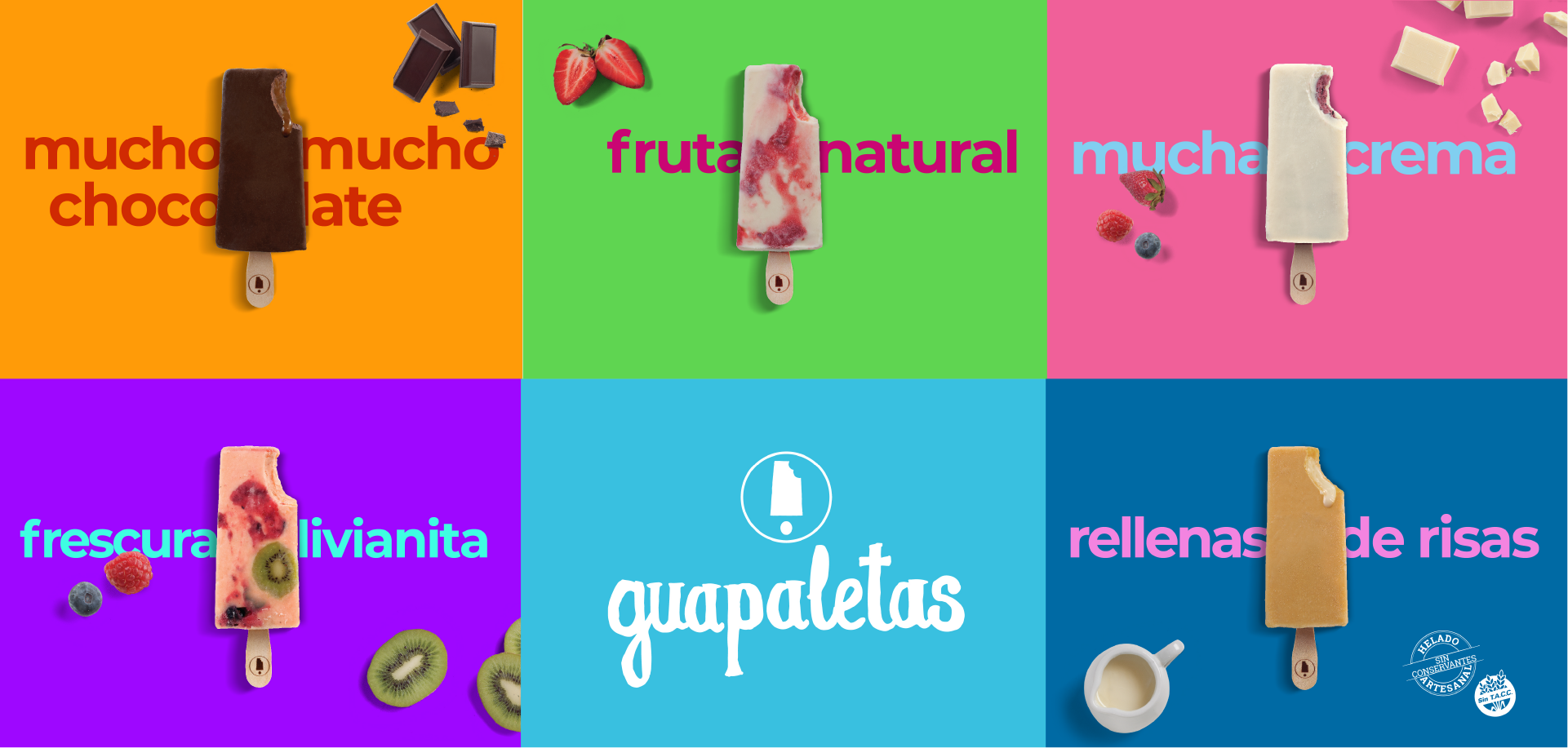
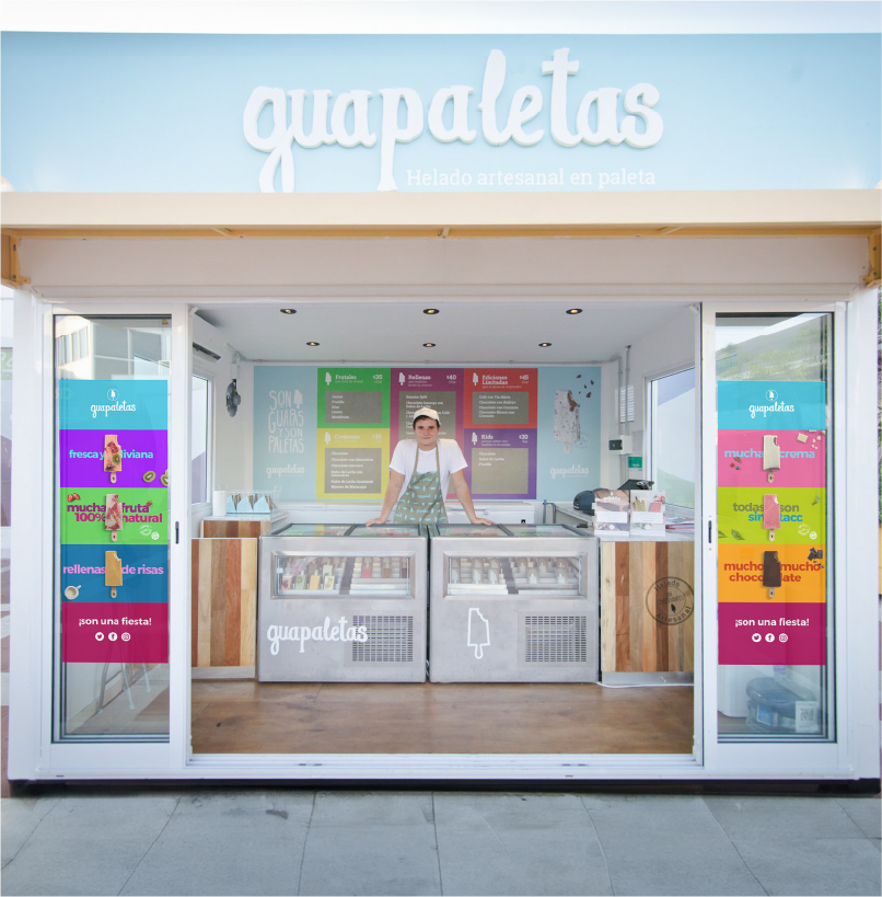
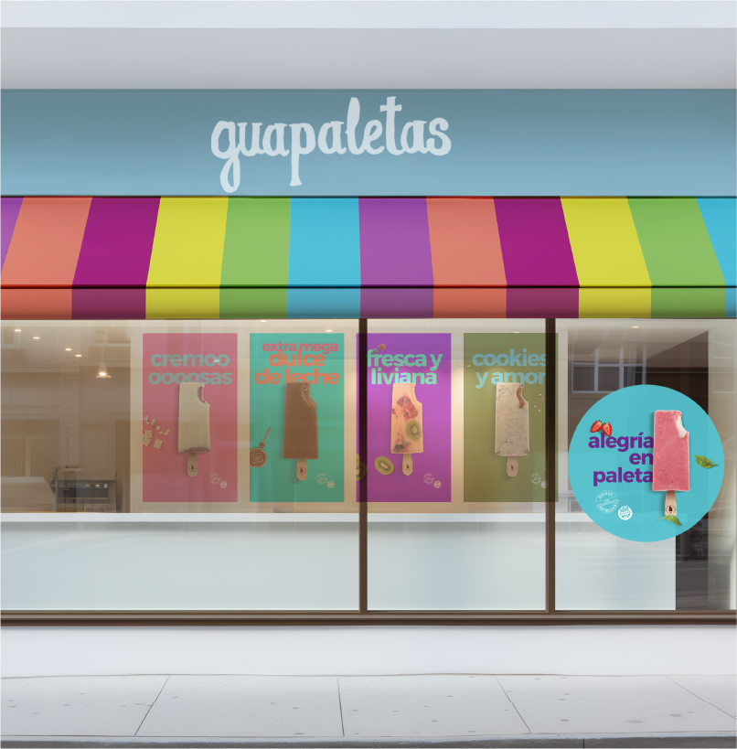
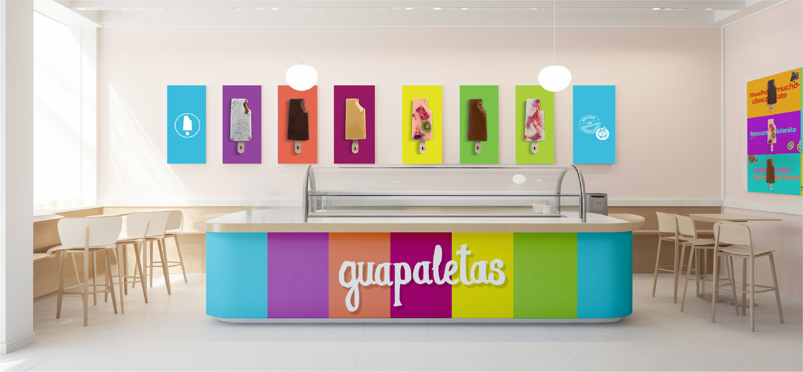
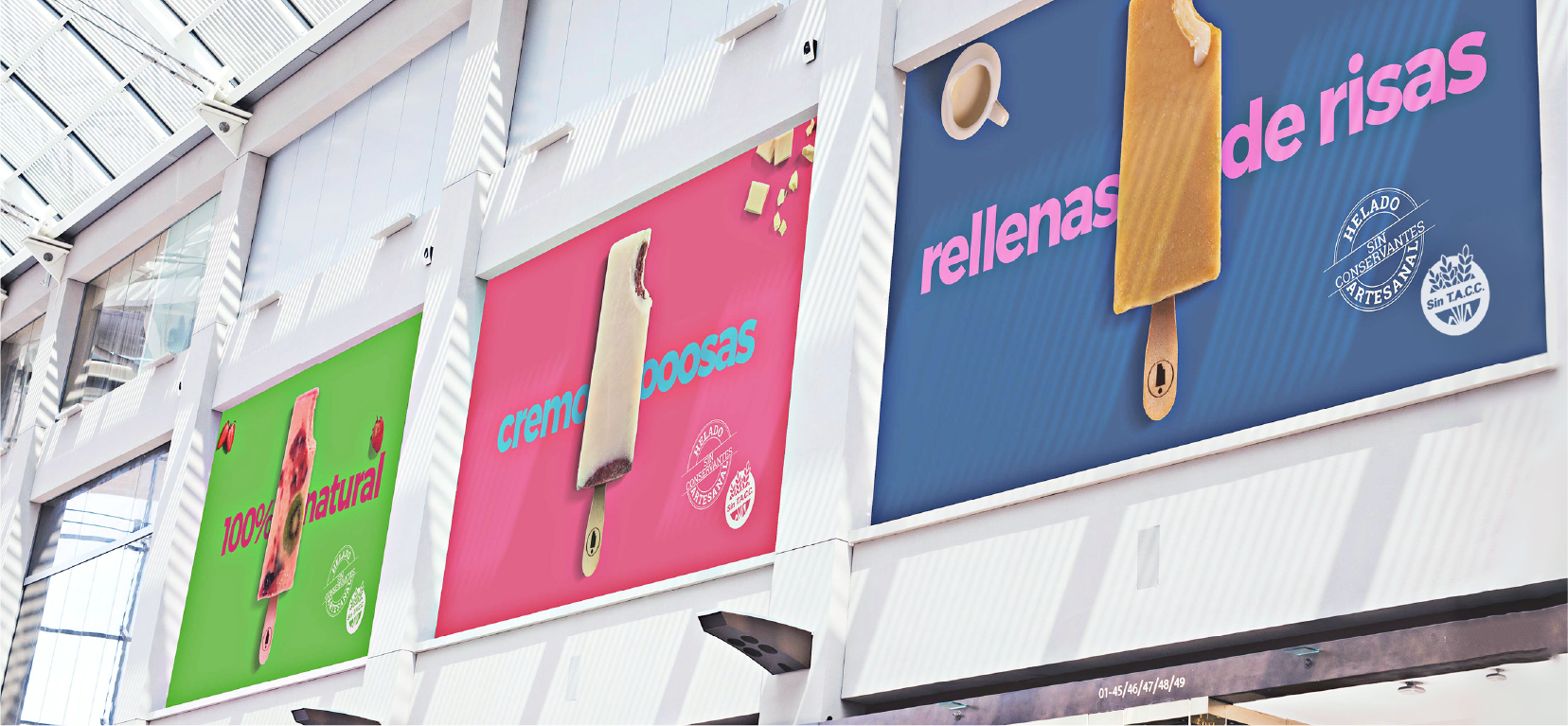
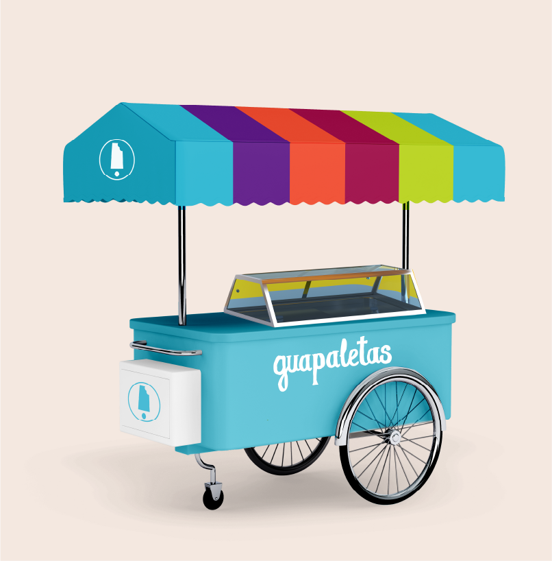
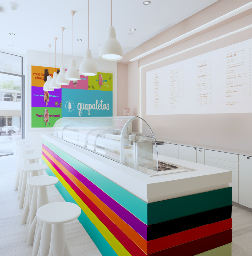
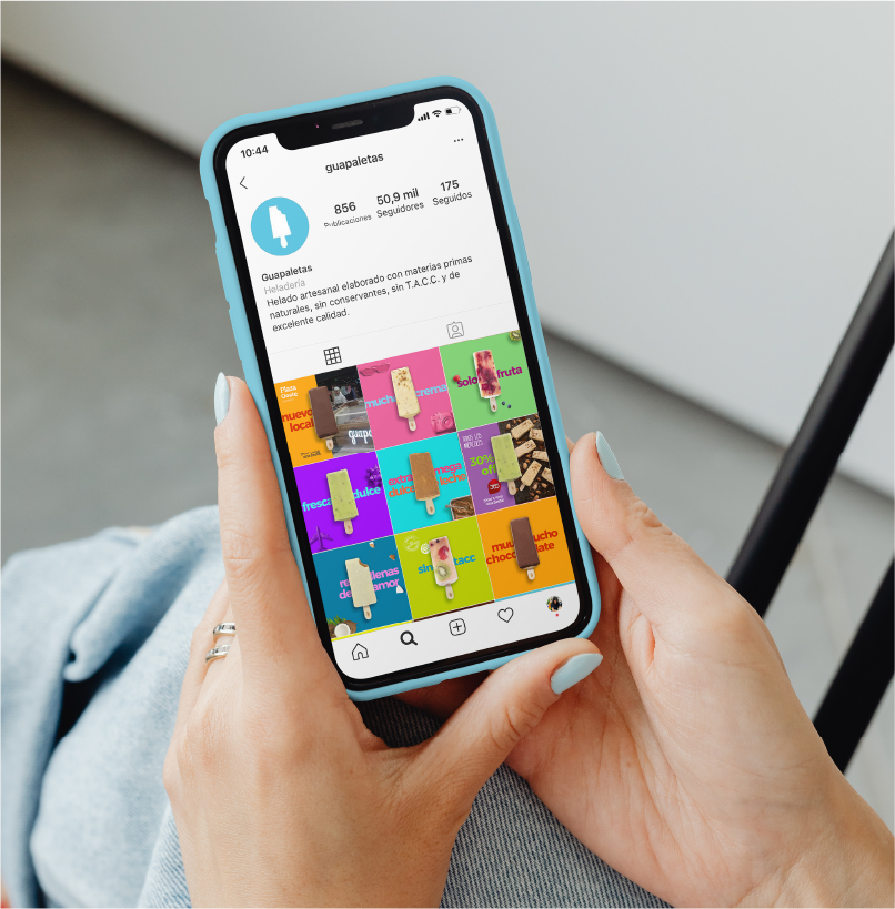
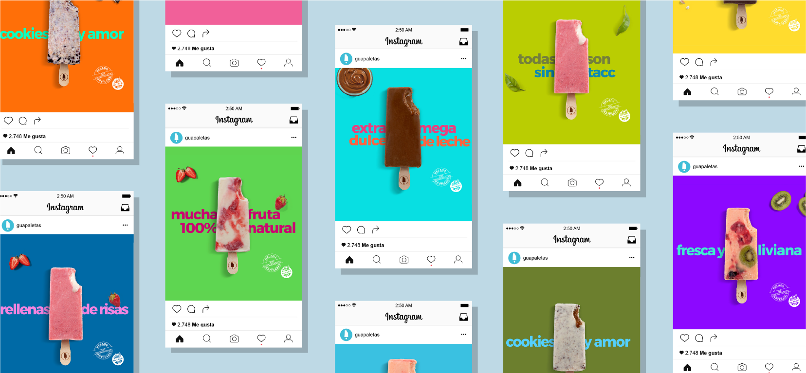
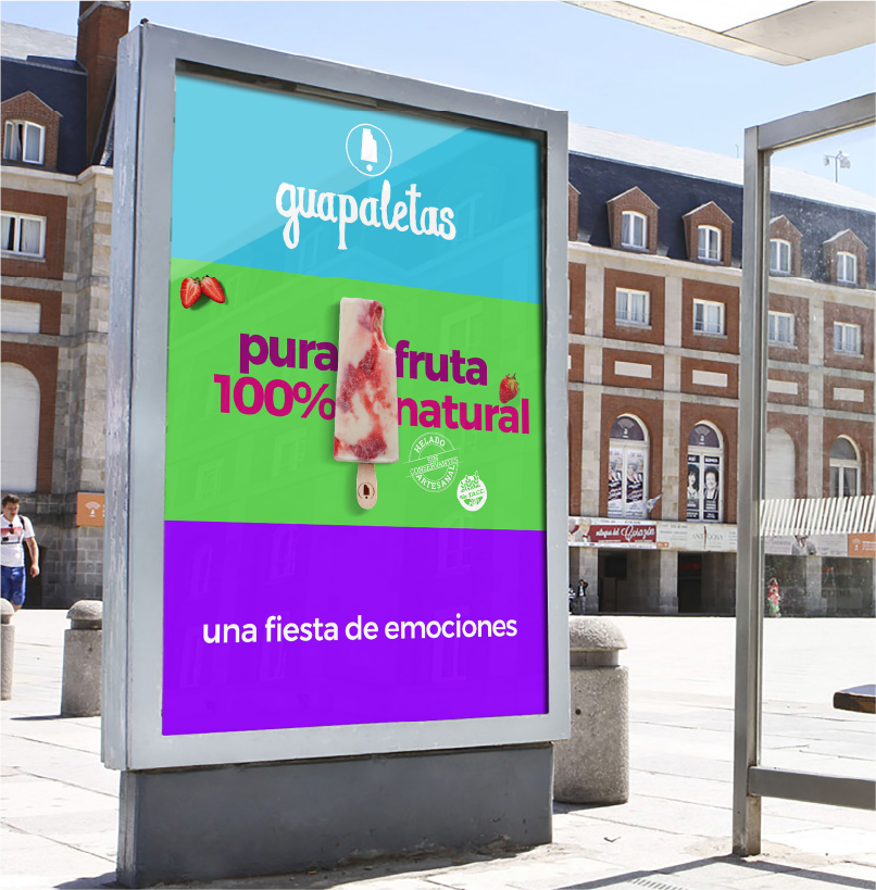
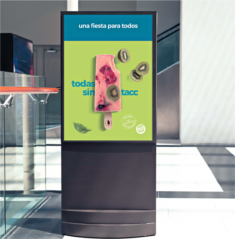
We created a bold chromatic approach. The brand palette features an eclectic mix of primary and secondary colors that suggest the idea of diversity of flavors and ingredients. It also serves as an organizing motif, featuring a modular design built around a simple grid of color blocks.
The new identity eliminates all the visual noise typical of ice cream brands. The chosen imagery reduces the brand to its essence of pure ingredients and fantastic flavors.
fantastic flavors.
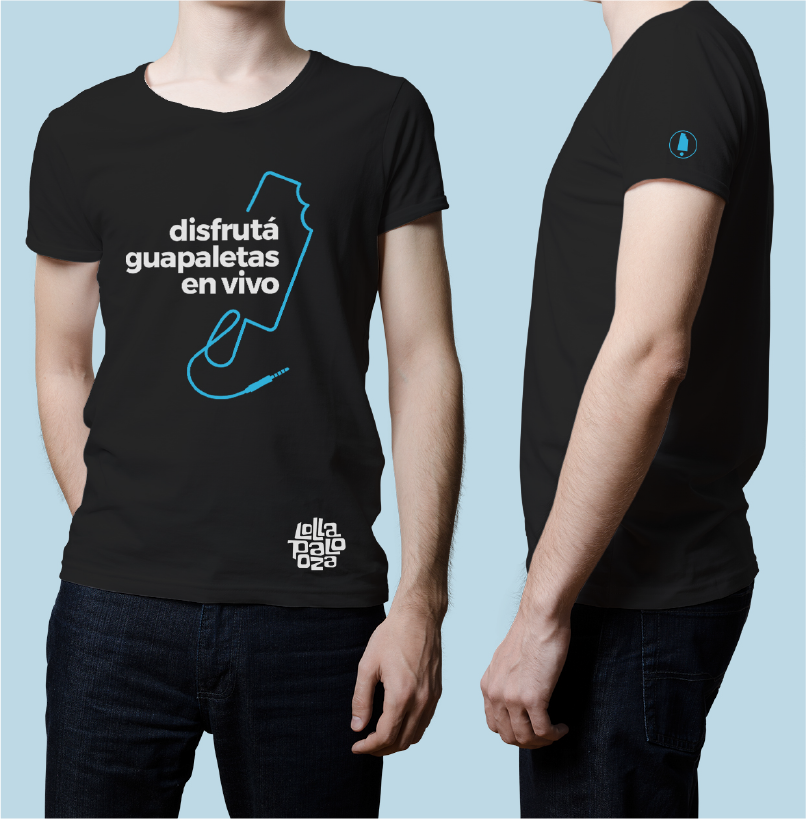
The simple, sans serif typography runs through the entirety of the pieces, highlighting a fresh, modern
and cheerful message. The brand’s message is fresh, modern and spontaneous.