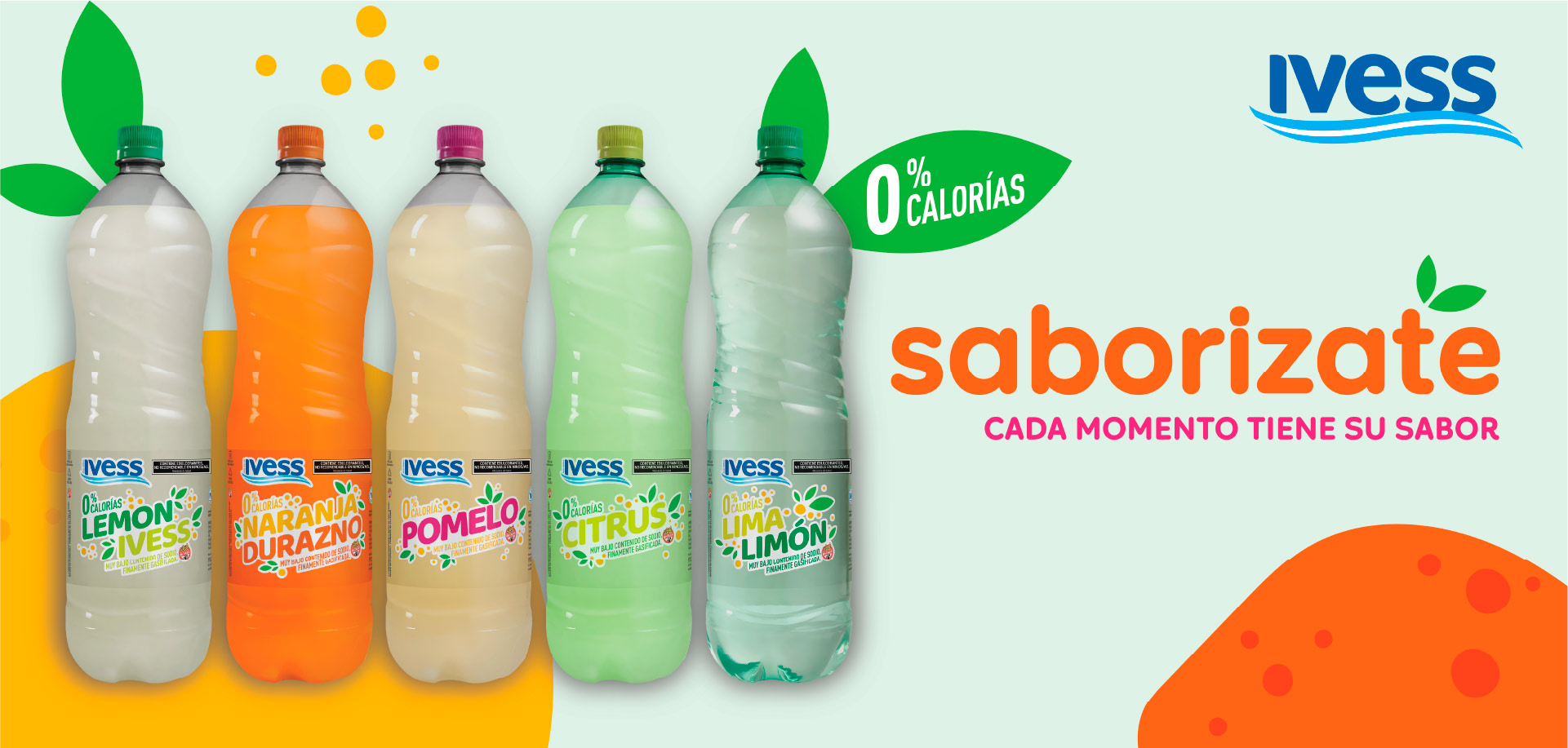
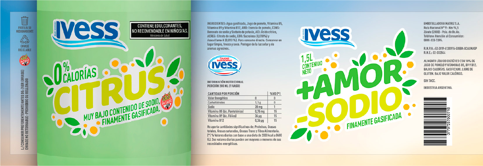
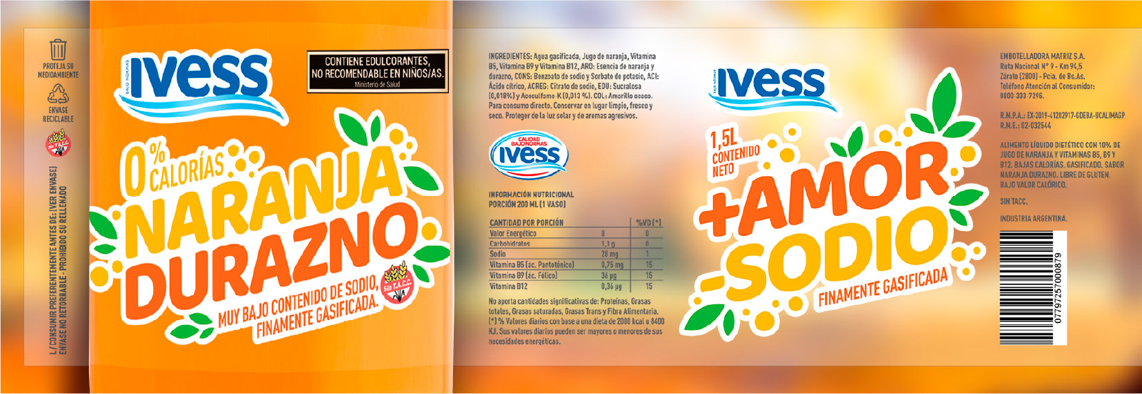
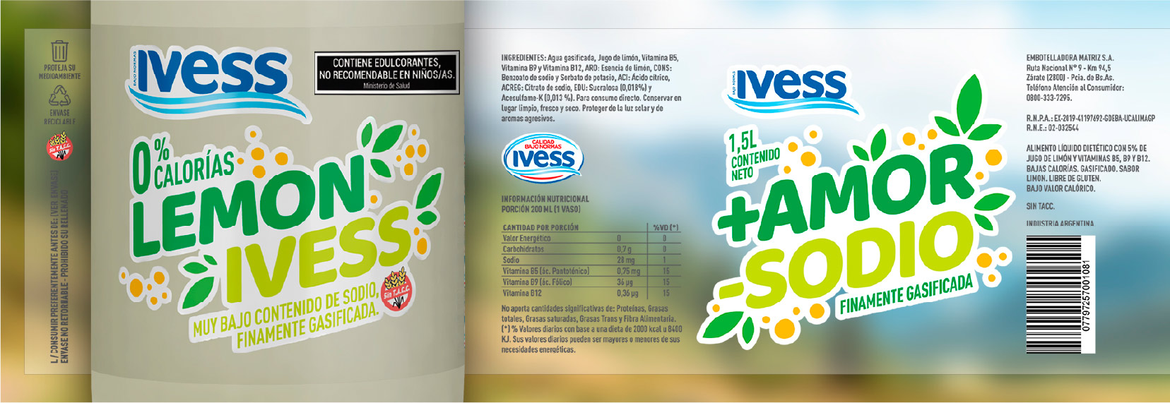
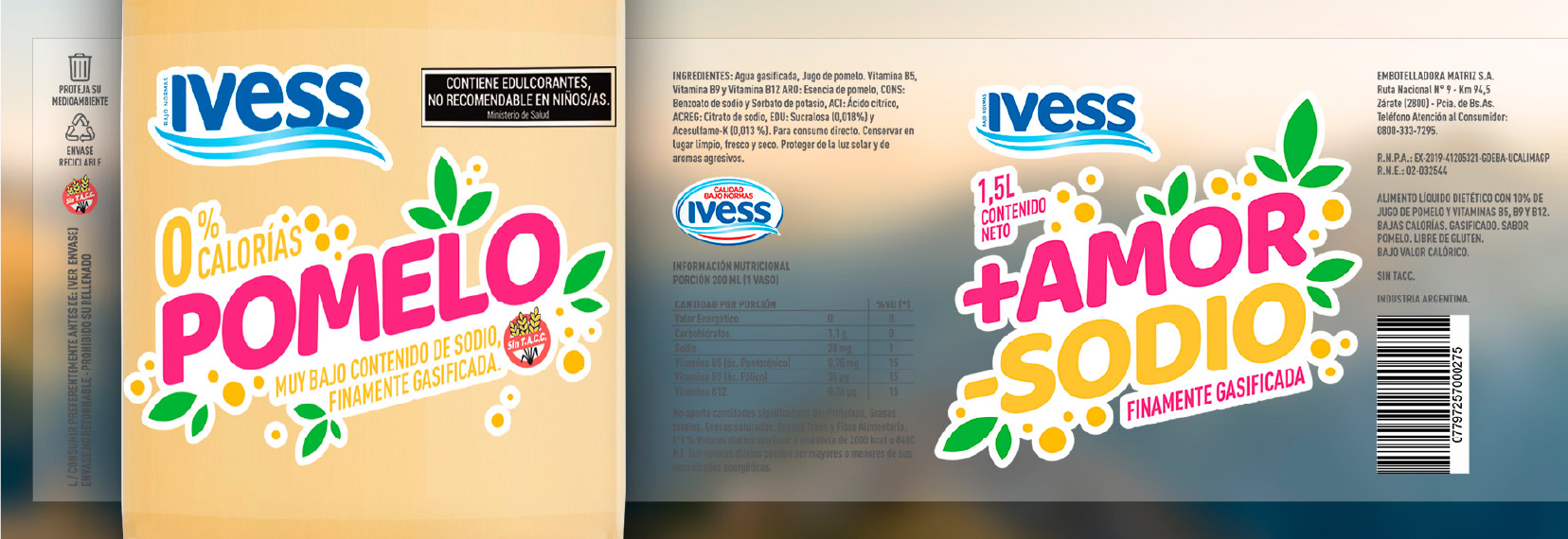
A colorful brand identity was designed to help the brand stand out in the category. The flavor name is integrated with nature-inspired illustrations, and can appear
in various colors depending on the flavor.
We used a typeface with stroke thicknesses and redrawn endings, to personalize it and reflect the natural.
The label is transparent, to highlight the flavor and content of the water.
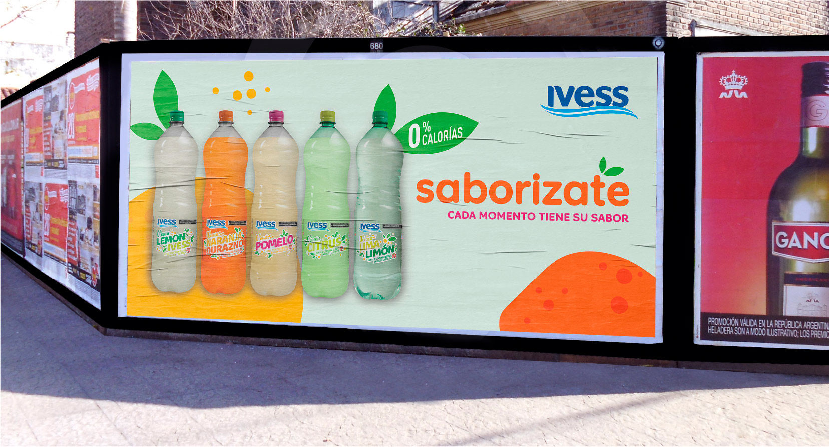
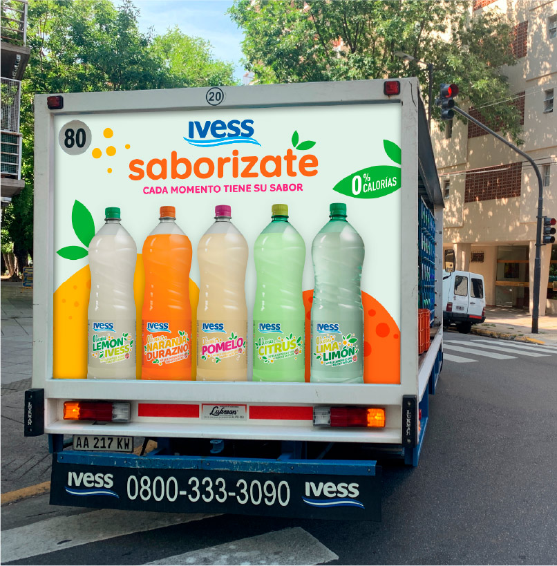
The illustrations also extend to promotional materials, such as posters, street signs and store displays.